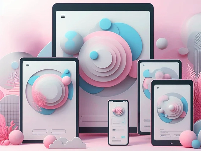
Responsive design is not a new concept on the web. For many years we have utilised media queries to adapt web pages across screen sizes and devices. Yet, in true engineer fashion, most people took a very systematic approach to this.
Standerdised breakpoints
The most common of these is to pick 3-4 common device sizes to focus on and create a set of consistent breakpoints. These are usually named something like: mobile, tablet, large tablet and desktop. With this approach, every time you need a new page, the designer will provide 4 designs; 1 for each size. Then during the build, the developer will match their media queries to those designs. Those pages are then checked at those breakpoints to make sure they match the designs. Once everyone is happy with the result, the page gets deployed and we move on to the next one.
As long as you did some research when picking the breakpoints, this approach can work well. Assuming the majority of your users will see that page at those exact viewport sizes (or close to them). But it’s likely that between those breakpoints, the page won’t look it’s best. For example, when a single column layout gets stretched so far the page looks empty. Or times when the content is a little tight for a few pixels until you hit that next breakpoint.
In such cases, a fluid layout approach could be a better solution. The concept is that the layout is completely fluid and will adjust as and when it needs to. So the values you use in your media queries could be completely different between pages. This is because you are building the pages to suit the layout of the content rather than a static list of values. Fluid layouts allow for a more seamless transition as the viewport scales. This helps you eliminate any content displaying in an odd way between breakpoints.
How fluid layouts differ from breakpoints
The best way to approach creating fluid layouts is to utilise fluid units. Percentages (%), viewport width (vw) and fractions (fr) are the main ones you will need to get familiar with. These units will create some basic responsive behaviour even without any media queries! You can then layer in media queries at points where content needs to adapt to a particular viewport size. The goal is for your page to look good at any size and on any device. Whether a user is on a particularly narrow phone (hello Samsung fold) or on an ultrawide 49" display.
By adopting a fluid layout approach, you ensure that your website appears as intended. You also mitigate the risk of jarring layout changes at specific breakpoints. Instead, the layout will fill the screen in a natural way and provide a more satisfying experience.
But what about consistency?
A fluid approach to layouts doesn’t mean an end to consistency. There will be use-cases where a standardised set of breakpoints will come in handy. Some areas of your page may need to be in alignment and change at the same time. So it’s still useful to have a few consistent queries to rely on.
The trick is use them only where they are useful rather than to restrict yourself and others on your team. You should still have the freedom to add any other media queries you need to make the page look it’s best. Even if those queries don’t fit into a standardised set.
Fluid typography is your friend
Making your typography more fluid will also help in achieving the fluid effect. By using CSS functions like clamp() you can make your typography scale with the viewport. This is a much nicer effect than an abrupt font size change and helps keep everything on your page balanced. And for those supporting older browsers - you can achieve the same effect with a combination of calc() formulas and media queries.
Remember, the goal is to create a smoother visual transition as the screen size changes. Fluid layouts and typography are all about embracing the web’s inherent flexibility and making your site look great at any size.
Beyond the visual aesthetics, fluid layouts are also about improving the user experience. They provide better readability across screen sizes and devices than adaptive layouts. Also, they ensure that interactive elements are accessible, regardless of the device size.
Give fluid layouts a try
To conclude, I’d like to invite you all to give this approach a try. Especially those who have never strayed from their consistent set of breakpoints. In addition to the many issues the fluid layout approach solves, it can also help you future proof!
The increasing variety of device sizes and resolutions can make development very difficult. We dread the idea of new devices with unique screen resolutions getting launched. And if they become popular enough, it could result in having to refactor all your pages to fit the new normal. With fluid layouts, these issues will be far less likely. Your site will adapt seamlessly to any screen size and ensure a consistent user experience.